| How text relates to the page |
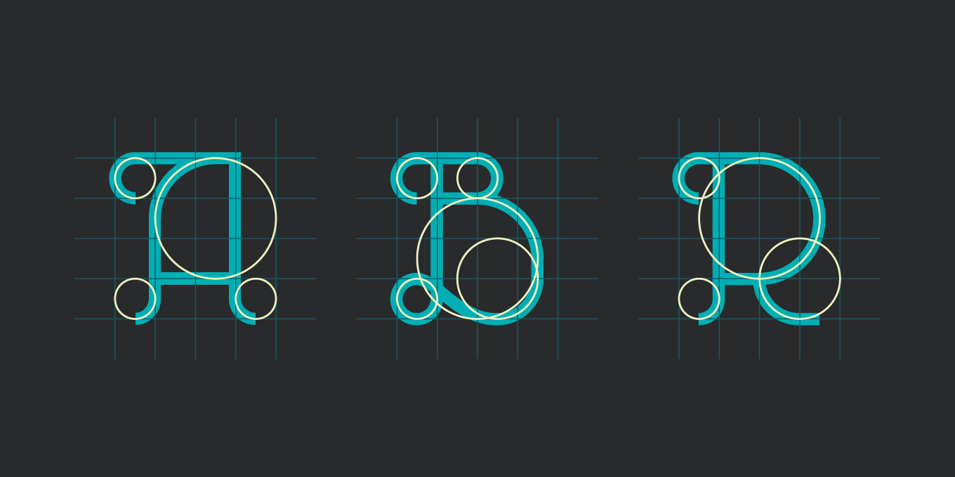
First, we’ll start with the definition: typography is the visual art of creating written words. Before the digital age, typography was a rather specialized craft that was confined to the worlds of book and magazine design and a range of advertising and public works. Road signs, billboards and product packaging are some examples of where typography is used in the physical world. Once the internet became a graphic medium, however, the art of typography exploded in a thousand different directions. Never before in history has the printed word shown up in such abundant visual diversity. Web designers now have countless fonts to choose among, as font-creators sell and share their work online. |
The challenge of being a good typographerUnfortunately, an unlimited choice of fonts does not automatically mean the web designer has the ability to know which one is best. Choosing a font is a matter of being versed in some basic rules of typography and of having a bit of an artistic eye as well. The rules are learnable, and perhaps the artistic eye develops over time. See below for a tutorial on typography and design. |
|
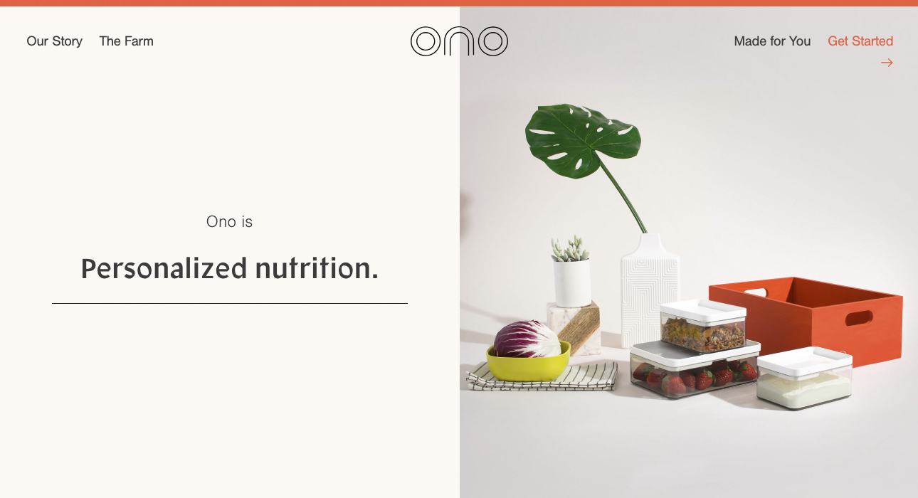
Basic elements of typographical designFonts are chosen partly with a sense of the aesthetic tone they convey, and partly for their “legibility.” This term describes the ease with which individual letters can be identified. Some fonts have been polished for centuries, and they’ve become common for a good reason. There are numerous descriptive terms to separate fonts into general categories, such as “serif,” “sans-serif,” “monospaced” and “cursive.” These definitions are relevant to the traditional types of text-fonts, but have no meaning when applied to an artist’s creation such as this rather unsettling alphabet. Another word, “readability,” applies to the relationship of the letters to each other, as well as to the interaction of colors between the text and the background. You can have a beautiful font, but if you’ve got grey letters on a yellow background, no one will be able to read it. The “leading,” or space between lines of text also influences readability. This space should be between 1.25 and 1.5 times the font size. A good font will also usually have “kerning,” which means that the space between letters will be adjusted to fit the shape of individual letter pairs. |
|
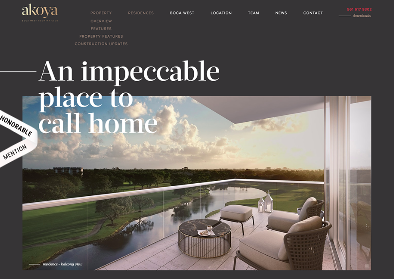
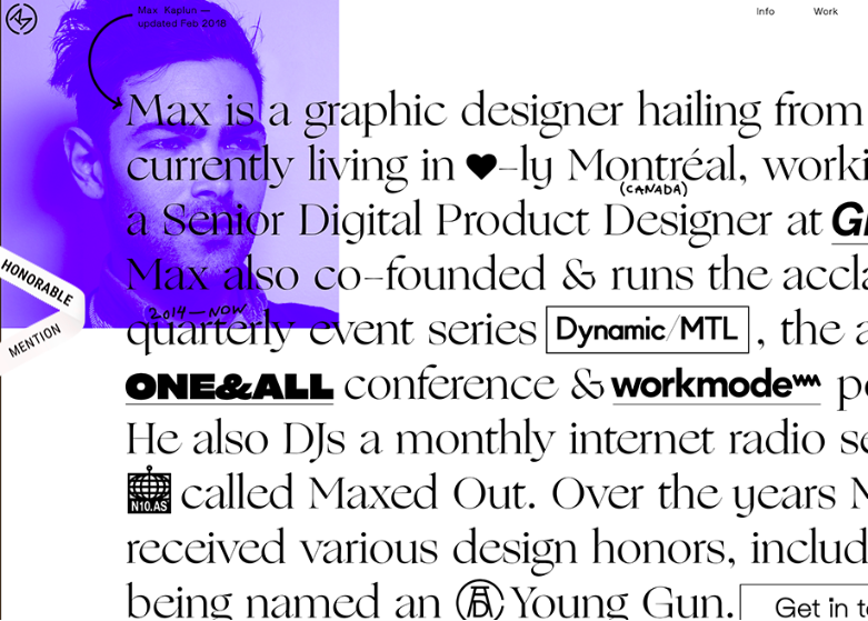
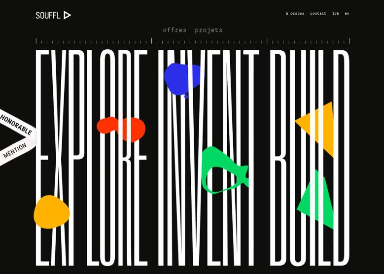
How the text relates to the pageFurther typographical design choices center on how the lines and blocks of text are set on the page. Lines that are too long tend to lose the reader’s interest, and a page that’s too crammed with text will feel like a crowded room and make the user want to click away. The practice of making headings larger than text helps to guide the reader’s attention and give clues about the structure and meaning of the page. Also, the interaction between images and words can feel natural or awkward, due to the structural way the text flows around the image. |
|
Art vs. function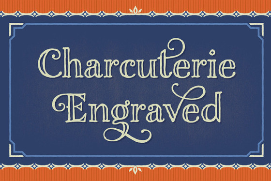
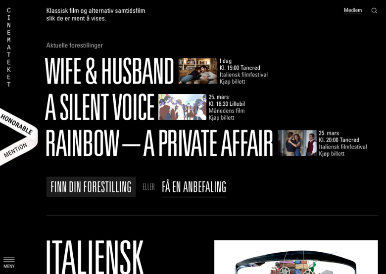
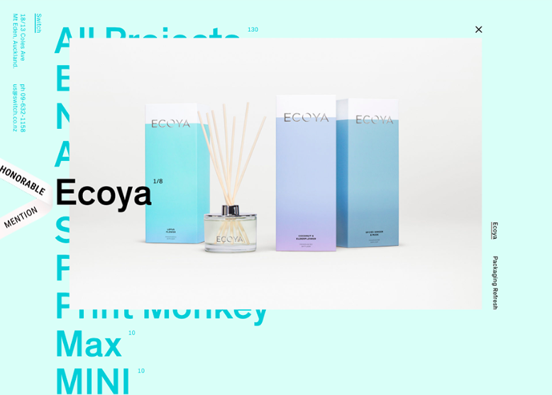
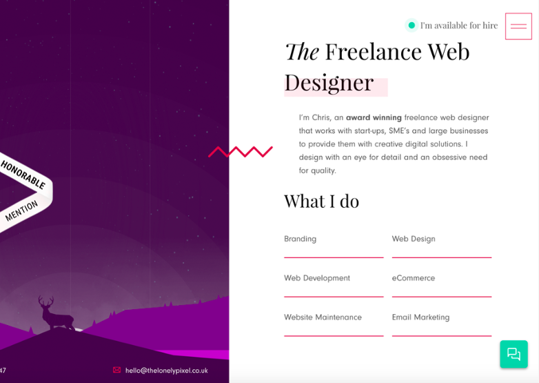
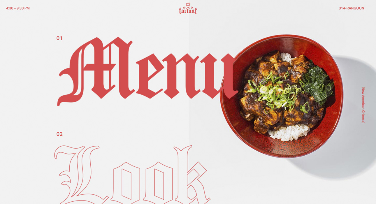
These are the two factors that typographers are always balancing. A web designer might purchase a display font such as “Charcuterie Engraved” for a banner or a logo, but a news article written in such a font would be exhausting to read through. Even while more and more artists offer their unique font creations, legibility research is providing specific information to support the use of classic-type fonts for blocks of text. See below for examples of how typography affects design. |
|
| See Examples Here: |
|
