| Typeface Classification |
Sometimes called "generic font families", these are large groupings of typefaces based on a number of generic classifications that different fonts fall under. On Web pages, there are four types of font classifications that you are likely to see: |
|
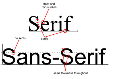
Serif Serifed typefaces were popular much earlier than sans-serif typefaces and include semi-structural details on many of the letters. People often refer to them as feet, although that is in no way a proper anatomical term when referring to typography. Their are many different classifications for serifed typefaces, often named for their origins, including Grecian, Latin, Scotch, Scotch Modern, French Old Style, Spanish Old Style, Clarendon and Tuscan. Some of these classifications can also be placed into broader classifications of typography including the styles below.
|
|
Sans-serif Just exactly like what is sounds, a sans-serif typeface is a typeface without serifs. They can be found in history as early as the 5th century, although the classical revival of the Italian Renaissance return to old style serifed typefaces made them virtually obsolete until the 20th century. Their was much development of sans-serif typefaces in Germany as a revolt against the ornate lettering of the popular Blackletter styles which led to sans-serif typefaces based on the purity of geometric forms. Much like serifed typefaces, there are many different classifications for sans-serif typefaces, including Gothic, Grotesque, Doric, Linear, Swiss and Geometric. Some of the broader classifications are listed below. |
|
|
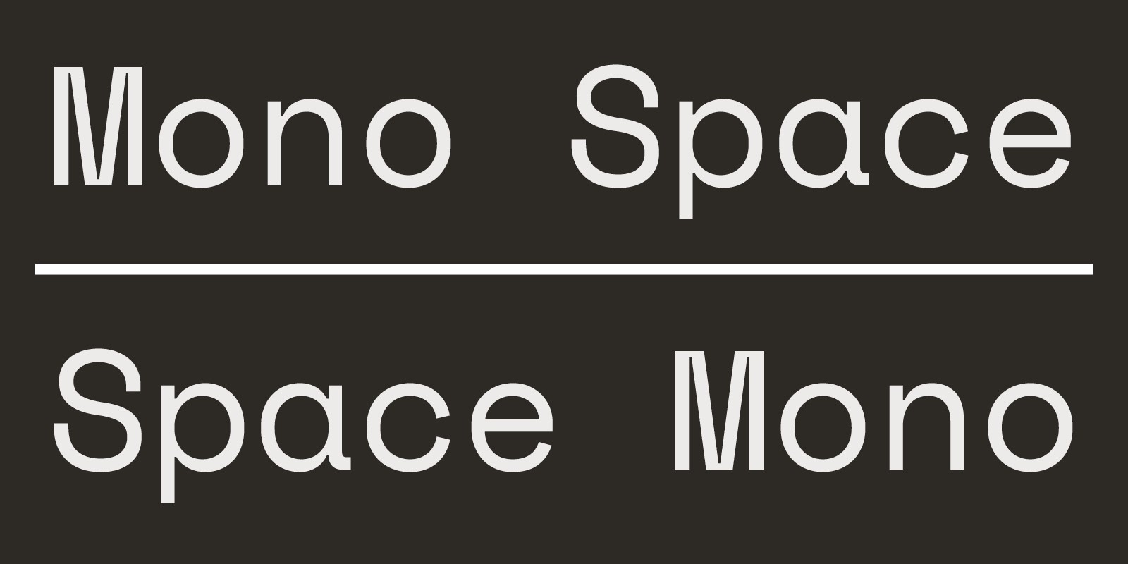
Monospaced The system fonts Courier, Monaco, and Consolas are examples of monospaced fonts, so named because every character is the same width. Most other fonts are proportionally spaced, meaning the characters vary in width. Monospaced fonts were invented to meet the mechanical requirements of typewriters. They were not invented to win beauty contests. Compared to proportional fonts, monospaced fonts are harder to read. And because they take up more horizontal space, you’ll always get fewer words per page with a monospaced font. In standard body text, there are no good reasons to use monospaced fonts. So don’t. Use proportional fonts. 
|
|
|
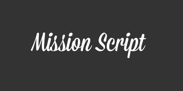
Script Script typefaces are based on the forms made with a flexible brush or pen and often have varied strokes reminiscent of handwriting. There are many different classifications including Brush Script, English Roundhand and Rationalized Script. However, the broadest forms of classification are Formal Script and Casual Script. Formal Scripts are based on the developments and writings of 17th and 18th century handwriting masters such as George Bickham, George Shelley and George Snell. Casual scripts developed in the 20th century as a result of photo-typesetting and are more varied and the inconsistencies appear to have been a result of using a wet pen rather than a pen nib. 
|
|
|
There are also a number of other font classifications that are offshoots of these. For example, "slab serif" fonts are similar to serifs, but they all feature a recognizable design with thick, chunky serifs on the letterforms. Websites today, serif and sans-serif are the two most common font classifications that are used. |
